Introduction
Best Online Courses to Master Data Visualization in 2025 are essential for professionals aiming to transform raw data into powerful insights. In this guide, we’ll explore top-rated learning paths that teach you to design interactive dashboards, build custom charts, and tell compelling data stories using tools like Tableau, Power BI, Python, R, and Excel. Whether you’re a beginner or an experienced analyst, these courses help you enhance your skills and thrive in data-driven careers such as business intelligence, marketing analytics, and consultancy — with Career Plan B providing expert support every step of the way.
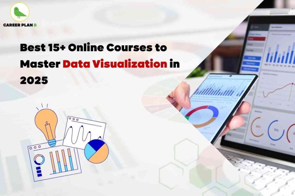
15+ Top Online Data Visualization Courses to Take in 2025
- Data Science: Visualization (Harvard – Professional Learning)
Learn visualization basics using ggplot2 in R through real-world case studies in public health and economics. - Data Visualization with Python (IBM on Coursera)
Use Python libraries like Matplotlib and Seaborn to create analytical visuals. - Share Data Through the Art of Visualization (Google on Coursera)
Focus on storytelling, dashboard development, and accessibility in visualizations. - Data Visualization with Tableau (UC Davis on Coursera)
Learn dashboard creation and interactive storytelling with Tableau. - Data Visualization and Dashboards with Excel and IBM Cognos (Coursera)
Build dynamic visual dashboards using both Excel and Cognos tools. - Advanced Excel Visualization (PwC on Coursera)
Learn advanced charting techniques and pivot visualizations with Excel. - Understanding Data Visualization (DataCamp)
Get foundational training on charts, graphs, color usage, and more. - Introduction to Tableau (DataCamp)
Start with Tableau essentials and visual dashboard creation. - Introduction to Power BI (DataCamp)
Gain core skills in Power BI for creating data visualizations and reports. - Visualization with ggplot2 (DataCamp)
Master the grammar of graphics and create elegant visuals using R. - Introduction to Visualization with Plotly (Python, DataCamp)
Create interactive visualizations using Plotly in Python. - Data Visualization in Excel (DataCamp)
Learn best practices for charting and dashboard designs in Excel. - Visualizing Data with Python (IBM on Udacity)
Build visualizations using Python’s matplotlib and seaborn libraries - Analyzing & Visualizing Data with Power BI (Davidson College)
Learn BI reporting and visual insights with Power BI. - Data Visualization in R with ggplot2 (Johns Hopkins University)
Advanced course teaching deep R visualization techniques. - How to Create Executive-Level Data Visualizations (LinkedIn Learning)
Design high-level visuals for leadership presentations and reports.
How Career Plan B Helps You Succeed in Data Visualization Learning
CareerPlanB.co is your strategic partner in mastering data visualization. Here’s how it supports your journey:
- Personalized Course Recommendations based on your current skills and goals.
- Step-by-Step Career Mapping so you learn the right skills in the right order.
- Mentorship & Accountability with regular check-ins and learning support.
With Career Plan B, you move from just watching videos to actually mastering real-world visualization skills.
FAQs About the Best Online Courses to Master Data Visualization in 2025
Q1. Do I need coding skills to learn data visualization?
No. Tools like Tableau, Excel, and Power BI offer drag-and-drop interfaces. If you plan to use Python or R, basic coding helps but isn’t essential.
Q2. Which tool should I start with—Tableau, Power BI, Python, or R?
Start with business tools like Tableau or Power BI for quick wins. If you want more customization or data science roles, move into Python or R.
Q3. How long does it take to become proficient?
You can grasp basics in 2–6 weeks if you commit 3–5 hours weekly. With consistent practice, proficiency comes in 3–4 months.
Q4. Are certificates from these courses valuable?
Yes. Certificates from platforms like Coursera or DataCamp validate your skills and enhance profiles for recruiters or project-based roles.
Q5. Can I create a strong portfolio after online courses?
Absolutely. Use course projects to build dashboards, interactive visuals, and storytelling assets that demonstrate your range and proficiency.
Final Thoughts
Data visualization stands at the crossroads of storytelling and analytics. The courses above provide a rich toolkit—across tools, languages, and storytelling. Combine learning from these with structured mentorship from Career Plan B, and you’ll move from learning to doing and from doing to thriving in your data career.


